DataStories
Dashboards and interactive visualizations: stories driven by data. Click a thumbnail to open the project directly.
 Live demo
The Inventory of Doubt
When French museums hesitate over who made a work: 102 artists and 6,081 cautious records, drawn from the Joconde database.
Live demo
The Inventory of Doubt
When French museums hesitate over who made a work: 102 artists and 6,081 cautious records, drawn from the Joconde database.
 Live demo
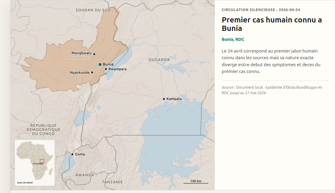
Ebola Bundibugyo — Storymap
An interactive dataviz tracking the Ebola alert between the DRC and Uganda.
Live demo
Ebola Bundibugyo — Storymap
An interactive dataviz tracking the Ebola alert between the DRC and Uganda.
 Live demo
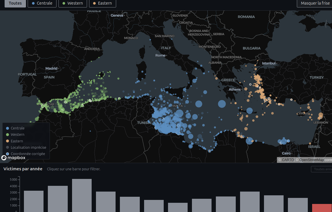
Death in the Sea — Dashboard
An interactive map of migrant deaths and disappearances in the Mediterranean since 2014.
Live demo
Death in the Sea — Dashboard
An interactive map of migrant deaths and disappearances in the Mediterranean since 2014.
 Live demo
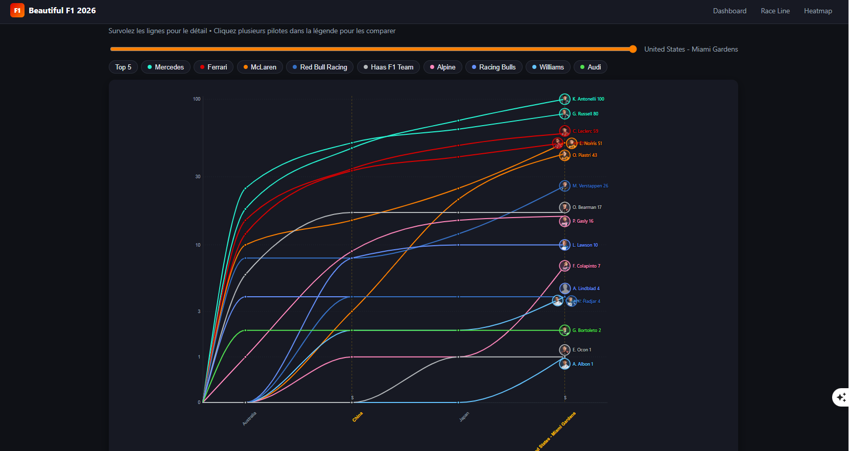
Beautiful F1 — Dashboard 2026
Interactive visualization of the Formula 1 season, powered by official FastF1 data.
Live demo
Beautiful F1 — Dashboard 2026
Interactive visualization of the Formula 1 season, powered by official FastF1 data.